This is a special one for the Candy Crush fans, but more than that, today you will learn how to replicate a text font when you are unsure abut which one to use
So..open a up a new Photoshop document..
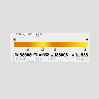
Lay a gradient over, using the settings described below :
To make things easier, import a printshot with your favourite logo in Photoshop, and paste it over your new canvas:
I've decided that a 200px Bold Arimo font will do the trick.. Feel free to use another font if you want too.. Write down "Cand" for now, using white as background.
Right click on your text layer and select "Create work path".
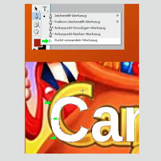
Grab the Pen Tool. Maybe there is another way, but I use convert-point to make all the dots on the work path visible. To select it right click on the Pen Tool icon and choose the last option.
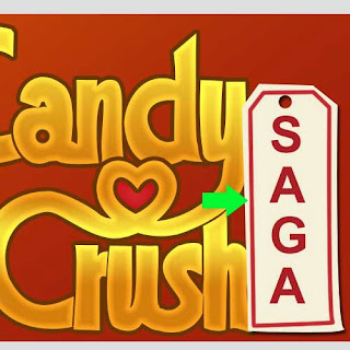
This option is marked in the next printshot with green arrow, and so are the work path dots.
Next thing to do is to place the path dots, over the original Candy Crush text, and this way you will obtain basically an identical letter. Take the corners and the middles and place them over the original Candy Crush text.. My Photoshop is in german but compare the icons. The best Tool to place the dots is the one pointed out by the green arrow below. Can be used to move the already existing path dots, or to add new dots. The next one with the minus is being used to remove dots.
Ok so now comes the funny part..
As you can see, I've moved some of the dots over the Candy Crush text and I've removed the useless ones. This is how my "C" letter looks like after this 1st step :
Now using your "Pen Tool" skills, drag the points,add some more, or delete - as needed - and create the same shape as the original C has.. Just like in my printshot below..
Now do the same thing for a,n and d. Lower the opacity of the layer so you can see exactly what you are doing.
Create new layer. Right click and select "Make selection". Fill in the selection with any color.
Apply the following settings to your new layer:
⦁ Inner Glow - Normal / 55% transparency / color # f1ca52
⦁ Gradient with these settings :
⦁ 6px outer Stroke using #713700.
Great days..moving on..
Continue until you finish up the entire text.
Apply same settings on "yCrush " too, except for the gradient, do use the following settings.
Fill the area inside the heart with #d92127, in a different layer. Burn up the borders (unsing "Burn Tool(O)")and light up a bit the center using the "Dodge Tool".
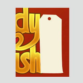
Create this shape in a different layer using #f7f3da as foreground color and the Pen Tool.
Apply a Shadow Effect with default settings.
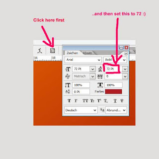
Grab your text Tool.
Arial-> Bold-> 72 px. Set the space between rows at 72px.
Write
S
A
G
A
just as shown below :
Create a new layer.
To create the next form, simply draw it again with the Pen Tool just like in the previous step.
Afterwards set your foreground color to # d92127. Set the brush to Hard Round 5 px.
Get back to your Pen Tool . Right click and select Stroke. Make sure "Pen Pressure" is unchecked and hit OK
Now in a different layer add this thread using a brownish color, and then burn it and dodge it several times.
Add some strokes of light.
UPDATE : One last step is to add the white border to the text. Load the selection of the text layers one by one.
In a separated layer, after augmenting the selection (Select ? Modify ? Expand) with 20px, fill it with white and add a default Shadow filter.
Check up on my final result.











No comments:
Post a Comment